


Our Federal Budget Dilemma
Federal Fiscal Exposure of US Counties

Note: Thanks for your patience during a semester sabbatical, I am back supplying this content, and hope you enjoy it, and urge others to subscribe.
Federal debt is now 120% of Gross Domestic Product. There are many issues surrounding the debt, too many for this post. What I do here is summarize the key points of an academic paper which I’ve published recently on the county level exposure to Federal budgetary decision. Mark Skidmore offered a similar piece on state effects. These findings are, I think, eye opening.
I begin my noting a half century of indebtedness as a marker for where we are today.

Of course, there are many good reasons why a nation would run a debt, just as there are good reasons why a household would be indebted. Investments in education, infrastructure are likely to produce more benefits than the costs of borrowing. Likewise, preserving the Constitution (through defense or foreign aid spending) are a key government responsibility.
We normally arrive at these decisions through a political process. In recent decades, most especially after the Great Recession, that political process seems far less effective. Perhaps we’ve forgotten that we elect members of the House and Senate to make policy compromises on our behalf?
One day, maybe, we’ll get back to that Constitutional order. When we do, it might be useful to think on when the USA actually balanced its budget. In particular, it’d be helpful to figure out what the Revenue and Spending share of those compromises were.

As it turns out, we end to run a budget surplus when both taxes and spending hover between 18.9% and 19.9% of GDP. So, when you hear someone claim the deficit is because we don’t collect enough taxes on billionaires, or that we have a spending, not a revenue problem — dismiss the comments as childish rhetoric.
We balance the budget when we collect a lot more taxes as a share of GDP, and spend a lot less. Our problem is about 3/5ths overspending and 2/5tsh under taxing ourselves. This is the ‘political equilibrium,’ there is no ‘economic equilibrium.’ It will require compromise in Congress and sacrifice from the public to achieve a balanced budget.
A snapshot on the challenge of this (which I omitted from the academic paper, because every economist knows this), is simply that we cannot readily ‘cut’ our way out of this budget deficit, much less shrink the debt.
We spend $2.74 trillion last year on mandatory spending (things we cannot cut, because the law says we must pay it). These are Social Security, Medicare, Income Security, Medicaid, Veterans Benefits and miscellaneous spending. Social Security and Medicare are 61% of that.
We spend about $679 Bill on Defense and $626 on ‘discretionary spending'.’ That discretionary spending is all the stuff we spend on energy, education, Housing and Urban Development, Energy, etc.
Our budget deficit last year was about $1.8 trillion. So, we could eliminate the whole military, cut all other types of discretionary spending, and we still couldn’t balance the budget. We’d still have to cut a half a trillion (or roughly 1/3rd) of all non-discretionary spending.
Given these facts, if you believe anything other than decades of compromise and sacrifice (less spending and higher taxes) is going to fix this, stop reading. I got nothing for you.
Our budget dilemma affects us all, but it affects us all differently, and because we live in different places, with differing economies and differing demographics, it affects our home towns, counties and states very differently.
My paper took a look at this issue, to map the incidence of budgetary effects at the county level. I looked at three big things: where is spending concentrated, where are tax collections concentrated, and where are industries that may be susceptible to higher interest rates concentrated. The first two of these are obvious. If we cut spending, it’ll have a disproportionate effect on places that currently rely heavily on federal spending. If we raise taxes, it will likely fall on the places that are already paying a disproportionate share of taxes. The only caveat is if we levied a regressive tax instrument to balance the budget.
The third item is less obvious. If we do not begin to slow and eventually reverse the size of the Federal debt, we will face higher borrowing costs everywhere (not just at the Treasury). This will affect places who manufacture or transport goods that are consumed through borrowing — or are more dependent on borrowed funds.
I begin with transfer payments, focusing on Social Security, Medicare, Medicaid, SSI disability, Supplemental Nutritional Assistance Program (SNAP), Earned Income Tax Credits (EITC) and miscellaneous transfer spending.
The distribution of this by share, mapped in more than 3,80 counties in the USA where data is available (~98%) are shown in the figures below. (More detail is in the paper in the Journal of Regional Analysis and Policy).

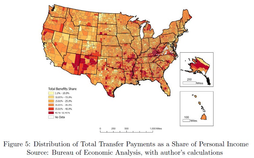
What’s immediately clear from this map, is that poorer places, particularly in the south and sunbelt are receiving a disproportionate share of Federal transfer payments. So, cuts in any of the above mentioned programs will fall disproportionately in these places.
The distribution of Federal civilian and military employees is also very uneven. Importantly, it isn’t really the D.C. area. The densest clusters of civilian employees as a share of total employment are on military bases. One Indiana County (which hosts Crane Naval Surfaced Warfare Station), has the densest distribution of Federal employment in the nation.

I next turned my attention to the places that will see economic stress from the status quo — those places with a very large share of GDP clustered industries that are most sensitive to higher interest rates. These are mostly goods producing firms, those who transport goods and those who produce energy.

Finally, I examine the distribution of taxes, using IRS data from 2021, and calculate the Effective Tax Rate for each county with available data. Due to a progressive tax system, this means that more affluent locations pay a higher share of their income in taxes. So, urban counties face much higher effective individual tax rates.

So how does all this shake out in terms of the geography of taxes, spending and risk of economic damage from the status quo? It is pretty clear given these maps.

Metropolitan places have a disproportionate share of Federal civil and military employment, outside a few dozen counties, it is small everywhere (as a share of total employment). Residents in urban counties pay about 15% more of their income in Federal taxes than do residents of non-metro counties (rural and micropolitan counties). Urban places have a higher share of interest rate sensitive industries, but a much lower (25% lower) reliance on transfer payments.
The single piece I found most interesting is the simple correlation between effective tax rates and share of income in transfer payments. This, right here, is the margin of adjustment that will feed all the policy debate on the Federal budget deficit for the next two decades.

Rich places pay the highest share of taxes, and poor places receive the highest share of transfer payments. The political complexity of this is both obvious, but analysis of it is well outside my area of expertise.
But, trying to tease out what local characteristics may contribute to the problem is a pretty simple affair. This table shows the effect of several demographic or regional characteristics on total transfers, social security, interest rate sensitive industries and the effective federal tax rate. The results aren’t really surprising.

First, the isn’t much that explains the interest rate sensitive industry location (and I didn’t even include the civil and military employment, because it is largely based on 19th and early 20th century logistics and price of land.
Clearly, richer places pay more taxes, poorer places receive more transfers. Older people move to higher quality of life places.
The one big factor (which I have to thank Mark Skidmore for pointing me to, is the disability rate. That single factor affects everything (much like per capita income and population size). Without it, the explanatory power of these regressions collapses significantly.
The disability rate may be a general measure of regional decline over the long term, since human capital is so closely tied to regional prosperity. It may also be a residual of the China Shock, with Autor, Dorn and Hansen found led to heavier use of Social Security Disability.
A snapshot of the places on both extremes is interesting.

10 highest “transfer to tax payment” ratio counties are all poor, dominated by Appalachia but include the Mississippi Delta region, and surrounding counties and the native-American reservation area of Kusilvak, Alaska. These are among the poorest places in the United States. The ten lowest transfer to tax locations are in the affluent vacation area of Teton, WY, Summit UT, Blaine, ID, San Miguel, CO, and Pitkin, CO, and fast-growing metropolitan locations like the very large greater Nashville, TN, and Washington, D.C. areas, or the smaller Midland, TX, or San Mateo, CA. The outlier here is King County, Texas, with fewer than 300 residents in the 2020 Census.
Finally, a simulation illustrates the effect on personal income of a 1% increase in tax collects or a 1% cut in transfer payments. Losses of economic welfare of either strategy are very unevenly distributed across the country.

I conclude with this.
As policymakers and taxpayers consider the suite of policy alternatives that surround a federal budget deficit of 120 percent of GDP, a few stylized facts emerge about the geography of effects. Tax increases, particularly those of personal income, will fall most heavily upon urban counties, particularly affluent urban counties.
This will also be the case if corporate taxes are included, as well as an increased lower threshold for social security (FICA) taxes. Reduction in transfer payments will be felt more heavily in poorer, rural places but also in poorer metropolitan counties. The nature of reduced benefits is somewhat less obvious. If cuts are made across all benefit categories, the reductions will be more concentrated in poorer, rural places. If benefit reductions affect future benefits, then the impact will be more concentrated among younger workers, who are more common in urban places.
Changes to public services inevitably affect government employment, due to the human capital-intensive nature of public services. These would be the most geographically concentrated of all effects, since government civil and military personnel are located in a few very concentrated counties. These are overwhelmingly dominated by military installations that base large shares of military and civilian workers.
Policy delay is also a choice. Continued expansion of the federal debt will slowly, but surely, increase borrowing costs as Federal bond sales require higher interest rates. As safe alternatives to private investment, this has the potential to raise rates over the long term. This would substitute our lengthy low capital cost period with a period of higher capital costs. This will disproportionately affect counties with a high share of interest rate-sensitive employment in manufacturing, construction, and real estate.
This little study isn’t a simulation of budget alternatives, nor does it provide guidance regarding the optimality of different choices. We do note that over the past 50 years, the Federal budget has been balanced when tax revenues and expenditures were roughly between 19 percent and 20 percent of Gross Domestic Product. Today, the nation collects 17.4 percent of GDP in taxes and spends 23.4 percent on goods, services, and transfer payments. It is reasonable that any future budget negotiations will note these facts and incorporate them into policymaking.
Note: This post was edited to correct a typographic error. If you see more, message me please.
Fascinating analysis and useful insights. Thank you. Is there a way to do a similar analysis by types of taxpayers, say by filing status? I’d be very interested in how that looks different than simply by county.